Wednesday, 9 March 2011

Stefano Pessina - Photographer

Having been to the photography workshops, I decided to look into existing work, and how this could influence my decisions regarding the poster for Task 2. After browsing through Flickr, I found some examples from an Italian photographer called Stefano Pessina (see his flickr account here). Some of the images I found looked very much like the kind of photo I would use as a background image or focal image in a poster. They were simple and crisp, with a lot of negative space, which could be used possibly for text. Here are some examples of what I found, and what I feel will influence my own photos:

Above: entitled 'Rinascere' which translates into 'Revive'. The depth of focus is limited to the bottom right, and draws your eye down, and the negative space in the top half of the image does the same.

Above: Untitled. The sharp angle in the top of the photo along with the contrast in colour is very striking and immediately divides the area. Text could easily be added to this to form a poster.

 Above: 'La neve se ne andra domani' translated to 'The snow will be gone tomorrow'. This image was accompanied by a short piece of poetry, which translated into:

But you go, but you remain
See the snow will be gone tomorrow
Flourished the past joys
With the wind of another hot summer.

I like the simplicity of this image, and the focal point being in the top left corner, rather than central.

Above: 'Vecchia Lione' This image is very cleverly shot. In the workshop we discussed grid structures of both posters and photography, looking at the Golden Section and Root Rectangles. In this photograph, there is a clear grid structure, purely produced by the objects within it. I have highlighted this below.


 Looking at these photographs, I have been given inspiration for a poster design, using negative space to my advantage, and looking at clear grid structure.

Final Sculpture

After experimenting with size, this is the final sculpture design:


I used the skills I learned with Laura in the photography workshop to photograph the piece,  looking at lighting and focus techniques.

Wednesday, 23 February 2011

Australian Flowers

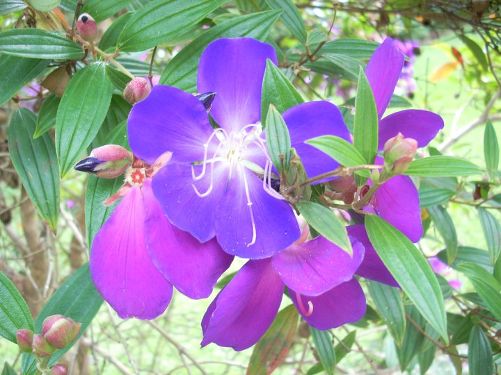
I was looking through some photos from my visit to North Queensland earlier this year, and found the photos I took of some Australian plants and flowers. I know that the first one is a Hibiscus flower but I can't seem to find the names of the others, sadly. Since my final design is producing a floral effect, I thought these might give some inspiration.
 

All these flowers are so different, and each have unique patterns and textures in them, which could help with my final piece. For example, the Hibiscus at the top has a pleated texture, not too dissimilar to some of Richard Sweeney's work. They all have symmetrical characteristics too, which can be found in my final designs for my sculpture.

Thursday, 17 February 2011

Leaf Design Development

This is the original leaf design I produced a couple of weeks ago, consisting of only 2 main parts:


Since then I have worked on a design consisting of 3 leaf repetitions, on a smaller scale for experimentation:


This is what the form looked like when folded together and attached at the base:


I then repeated the form and attached 4 together to produce a floral effect. 


This has proven rather successful, so I shall look into different scales and also add more repetitions to produce a more spherical shape. 

Nodular Forms

During the past couple of workshops, I have really found the repetitive nodular techniques the most appealing. Having worked on the leaf design in the previous post, I decided it would be best to explore that further, and create more variations of it, to work towards my final piece.

Below are some photos of Richard Sweeney's work that has involved using one nodular form and repeating it to produce a larger piece.


I find this technique a very appealing one, as I am really interested in symmetry and pattern. I will look into my leaf design and expand on it to produce a nodular piece for development.

Thursday, 10 February 2011

Workshop #2 - A2 paper

After trying out some designs on A5 paper, we were asked to then move onto A2 size paper to see how our designs looked in a larger scale.


^ Flat version of sculpture below ^


I found my leaf design worked the best in the larger size, and I would like to explore more variations of it, with more repetition. I like how different it looks from various angles, and depending on how I held it. I think I'll look at increasing the number of 'petals' to give more volume.

Thursday, 3 February 2011

Shop Windows!

There are loads of shops that use paper sculpture at the moment, two of these being Monsoon and Anthropologie. I had a look at what images I could find on various Flickr accounts and websites, and here's what I found:


Monsoon Christmas display: shapes slotted together with cut out decoration


Accessorize display, 3D lettering and cut out basic shapes


Monsoon Children's display: layered shapes in various sizes for movement.


Anthropologie window display: Classic paper chain structure, repeated in various sizes and lengths to create huge impact and height.


Anthropologie window display: Honeycomb repeated pattern (very useful for this brief!) with changes in scale and colour for depth.


Anthropologie window display: Paper birds hung at graduated lengths for a sweeping effect, giving lots of movement.

These examples have given me inspiration, especially the Anthropologie displays, which show use of repeated shapes and forms, fitting with my brief perfectly. I will use some of these influences in my own designs.