Monday, 14 March 2011

Colour Ways

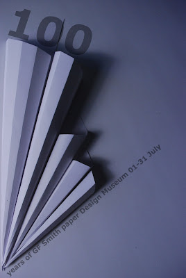
Now that I had settled on a poster layout with text, I needed to edit the colour levels on the poster, so that the shadows would be more pronounced and have more impact.

Above: I have heightened the brightness and contrast levels on this design to achieve more shadowing and give a blue colour wash. I like the atmosphere of this result, I think it works well with the text effect, giving the illusion that the text is an extension of the image.


Above: I have colourised the image to give a neutral tone to it, and also try to achieve the look of paper that could be 100 years old, in contrast with the very modern paper construction and typeface. The problem with this is that it has given the background image a grainy finish, which would compromise the quality of the final print at A2. I really like this design but I feel the quality is just not good enough.


Above: I have inverted the background image, which gave the neutral colour without the grainy result, but the shadows have been turned white, which is the obvious result of inverting the image. I feel this draws away from the atmosphere of the image, as the shadows are what gave the impact. Also, the text is somewhat fighting with the background image, as opposed to complimenting it and acting as an extension of it.

After looking at the three possible options, I have settled on the first design as the text and background image work well together, and the light and shadow are well balanced. I would however, if I had longer to experiment, look into more ways of achieving the aged look without compromising on quality.

Poster Development

Once I had a grid laid out, I had to add the text to the image. I settled on Helvetica as a font, because this is the font used for most of GF Smith Paper's promotional material, however I have used a variation entitled Helvetica Neue Bold, so there is a fresher look.


From these possible layouts I prefer the last one, The text has much more impact and looks more settled with the background image. It also doesn't take up too much negative space so there is a nice amount left for the shadows to work in.

Poster Layouts

After deciding on which photo to use for my final poster design, I found a way of splitting the image down into a grid format. I have already been sketching possible poster layouts, and have adapted one in particular to suit this image.


Since there are a number of ways I could add the text to the image, I will experiment and see which result is the most successful.

Wednesday, 9 March 2011

Poster Photography

After looking at various layouts and image possibilities in my sketchbook, and taking into account what I have learned through the workshops and artist research, I have settled on a photograph to make my poster with.

I decided to use a simple paper structure, but create lots of shadow and depth, leaving plenty of negative space.

These are the best of the photos that I took:

First of all, I used natural light to take my first set of photos, to see which composition looked the best.

Whilst I like the above composition, and It could be used as a part of a final poster, as a background image I feel it doesn't have enough negative space like the work from Stefano Pessina.
Once I found which composition looked the best, I used artificial light, blocking out the natural light to achieve shadowing and a more atmospheric colour.
^This is the image that I have chosen for my final poster design.^

I feel it has just the right amount of negative space and shadowing, and it has a strong grid structure within it. I will now look at how I can use this and its grid structure to produce a successful poster for GF Smith Paper.

Stefano Pessina - Photographer

Having been to the photography workshops, I decided to look into existing work, and how this could influence my decisions regarding the poster for Task 2. After browsing through Flickr, I found some examples from an Italian photographer called Stefano Pessina (see his flickr account here). Some of the images I found looked very much like the kind of photo I would use as a background image or focal image in a poster. They were simple and crisp, with a lot of negative space, which could be used possibly for text. Here are some examples of what I found, and what I feel will influence my own photos:

Above: entitled 'Rinascere' which translates into 'Revive'. The depth of focus is limited to the bottom right, and draws your eye down, and the negative space in the top half of the image does the same.

Above: Untitled. The sharp angle in the top of the photo along with the contrast in colour is very striking and immediately divides the area. Text could easily be added to this to form a poster.

 Above: 'La neve se ne andra domani' translated to 'The snow will be gone tomorrow'. This image was accompanied by a short piece of poetry, which translated into:

But you go, but you remain
See the snow will be gone tomorrow
Flourished the past joys
With the wind of another hot summer.

I like the simplicity of this image, and the focal point being in the top left corner, rather than central.

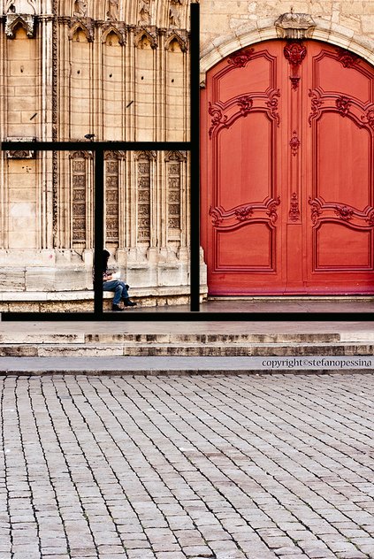
Above: 'Vecchia Lione' This image is very cleverly shot. In the workshop we discussed grid structures of both posters and photography, looking at the Golden Section and Root Rectangles. In this photograph, there is a clear grid structure, purely produced by the objects within it. I have highlighted this below.


 Looking at these photographs, I have been given inspiration for a poster design, using negative space to my advantage, and looking at clear grid structure.

Final Sculpture

After experimenting with size, this is the final sculpture design:


I used the skills I learned with Laura in the photography workshop to photograph the piece,  looking at lighting and focus techniques.