Above: entitled 'Rinascere' which translates into 'Revive'. The depth of focus is limited to the bottom right, and draws your eye down, and the negative space in the top half of the image does the same.
Above: Untitled. The sharp angle in the top of the photo along with the contrast in colour is very striking and immediately divides the area. Text could easily be added to this to form a poster.
Above: 'La neve se ne andra domani' translated to 'The snow will be gone tomorrow'. This image was accompanied by a short piece of poetry, which translated into:
But you go, but you remain
See the snow will be gone tomorrow
Flourished the past joys
With the wind of another hot summer.
I like the simplicity of this image, and the focal point being in the top left corner, rather than central.
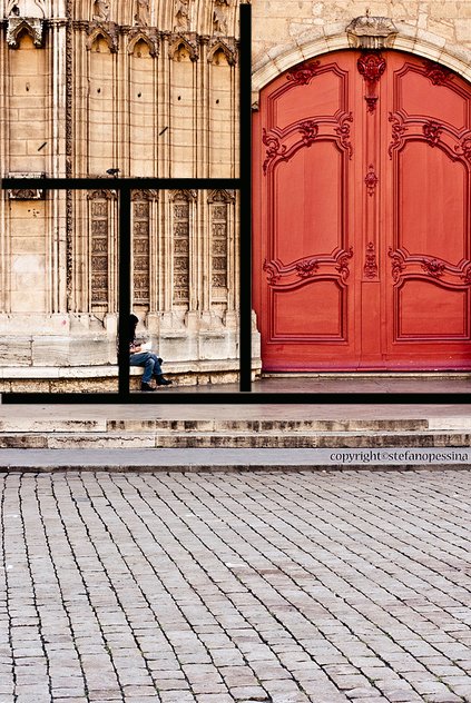
Above: 'Vecchia Lione' This image is very cleverly shot. In the workshop we discussed grid structures of both posters and photography, looking at the Golden Section and Root Rectangles. In this photograph, there is a clear grid structure, purely produced by the objects within it. I have highlighted this below.
Looking at these photographs, I have been given inspiration for a poster design, using negative space to my advantage, and looking at clear grid structure.


No comments:
Post a Comment